OnTime App

ONTIME APP

An OCAD University UX/UI course project to create a transit related app with user interview, persona, user flow map, low/mid fidelity prototype

Problem Statement


How might we provide information on local traffic conditions to drives, so they can better plan ahead on their commute before heading out.
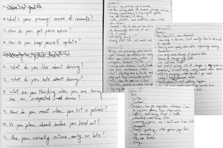


User Interviews


I interviewed 4 people (age 32 - 38) who are all living in suburban area. Driving is the main source of commute. However, there are always unknown road conditions or other traffic matters in the community.

Solution

Problem Statement:

The freedom of driving is great, but with unknown road conditions it can be problematic.


Solving The Problem:

An app for user to post any kind of traffic problems within their neighbourhood, which can help everyone in the community to plan ahead, and be on time.


Similar App:

My app is like Nextdoor, Reddit, and Facebook but for my user to solve surprise road conditions before they head out.


Task:

Users can use the app to create post about traffic problems they encountered in the community in order to notify others about the road condition before heading out.

Objects:

• Pen icon • Post icon • Location arrow • Camera • Star • Like • Comment • Forward arrow


Persona Research

When I was choosing my interviewees, I need to make sure they have a car, live in the suburbs, and driving is their first choice for commuting in the community.


I prepared 9 questions, and interviewed 4 people in age between 32-38. The questions are trying to learn about the interviewees’ lifestyle, and how will they react to possible scenario while they are driving.


Although the research was short. However, I realized there are many similarities from the answers.


Qualitative is the method I am using to create my persona. The app is targetting on a specific group of users. From the interview I am able to conduct key insight on user reactions, expectations, and emotions. Also the interviewees all get their news and stay updated through social media. From that insight I am confident that my persona will be someone who is digital savvy, and have their phone 24/7.


User Experience Map

The main task would be inputting / reporting road situation in the community, so others can see it, and plan ahead before going out.

User Flows Low-Fidelity Wireframe

One of the main task for my app is to have the user creating post when they

encounter a traffic issue.


I created a low-fidelity wireframe and ask a few friends to try to make a post

from the mockup in Marvel.


I am trying to minimize the amount of text my user have to read. I decided to

use social media familiar icons like Write a post button, star, and heart so

they don’t need to think what the icons are representing.


Low-Fidelity Wireframe (Feedback from User Testing)

Write a post icon:

The users’ feedback on where they look for the Write a post button weren’t consistent. Only 1 user was able to locate the icon on the top left corner. Others look at the bottom centre first.

Solution: Re-locate the icon to bottom


Category as default title:

User find it’s a bit repetitive to have to choose a category, and putting a similar title. Since there are only so many types of traffic matters.

Solution: Create a dropdown menu for the category. User can use default title, or choose Others to input custom title

Style Tile


The 2 dots on the logo represent getting from point A to point B. It’s still work in progress.

The colours I choose are inspired by the traffic light. The 4 major colours will represent a specific category in the app.

Share by: